
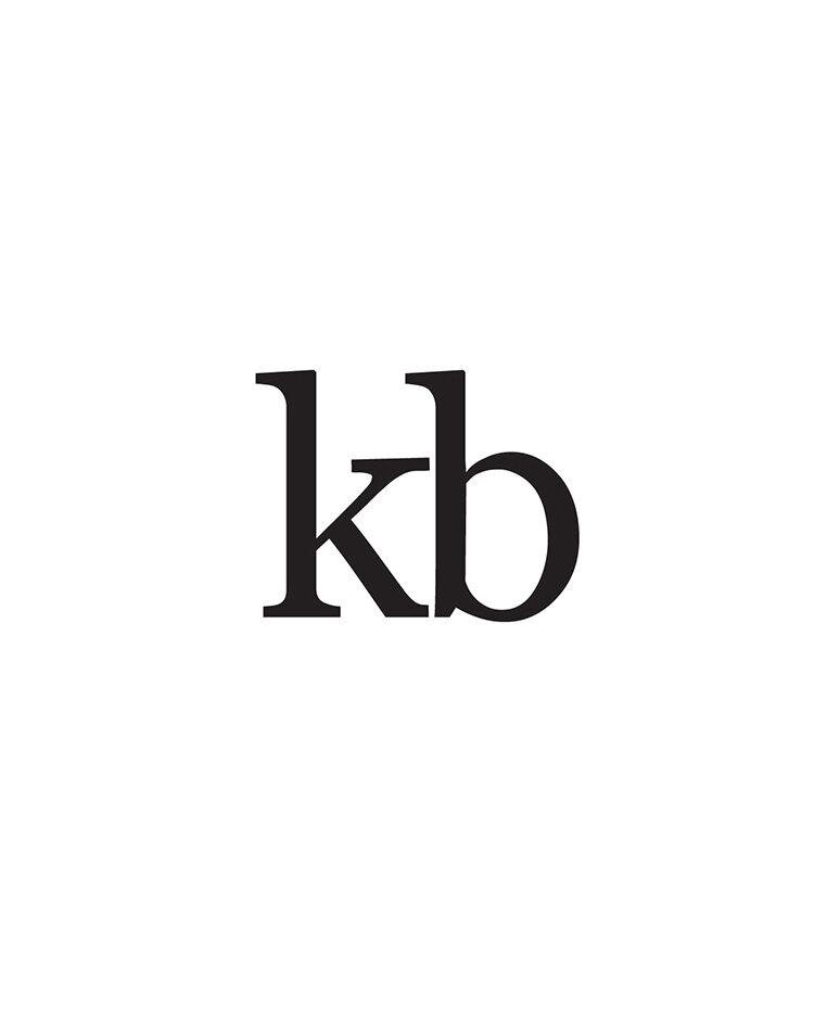
Founded in 2013 as kb, Katie Boyle’s eponymous jewelry line has always been “dedicated to producing jewelry designs that are fresh, current and timeless.” However, recently returned from the Comprehensive CAD/CAM for jewelry at the Gemological Institute of America’s London campus with a rapidly growing bespoke service, Katie needed her logo to reflect the growth and evolution of her brand.
Client: Katie Boyle
Services: Logo Design
Year: 2021
The brief
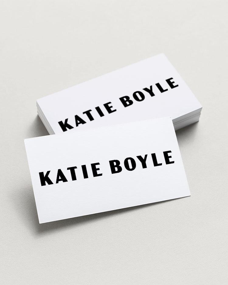
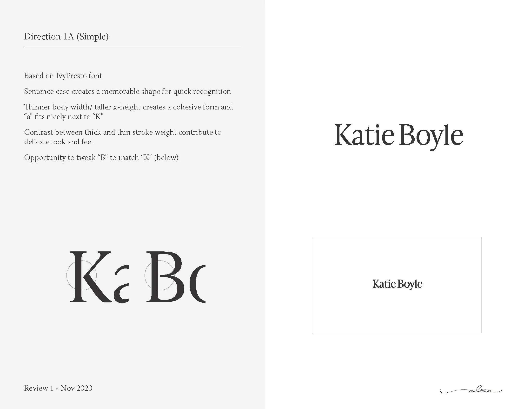
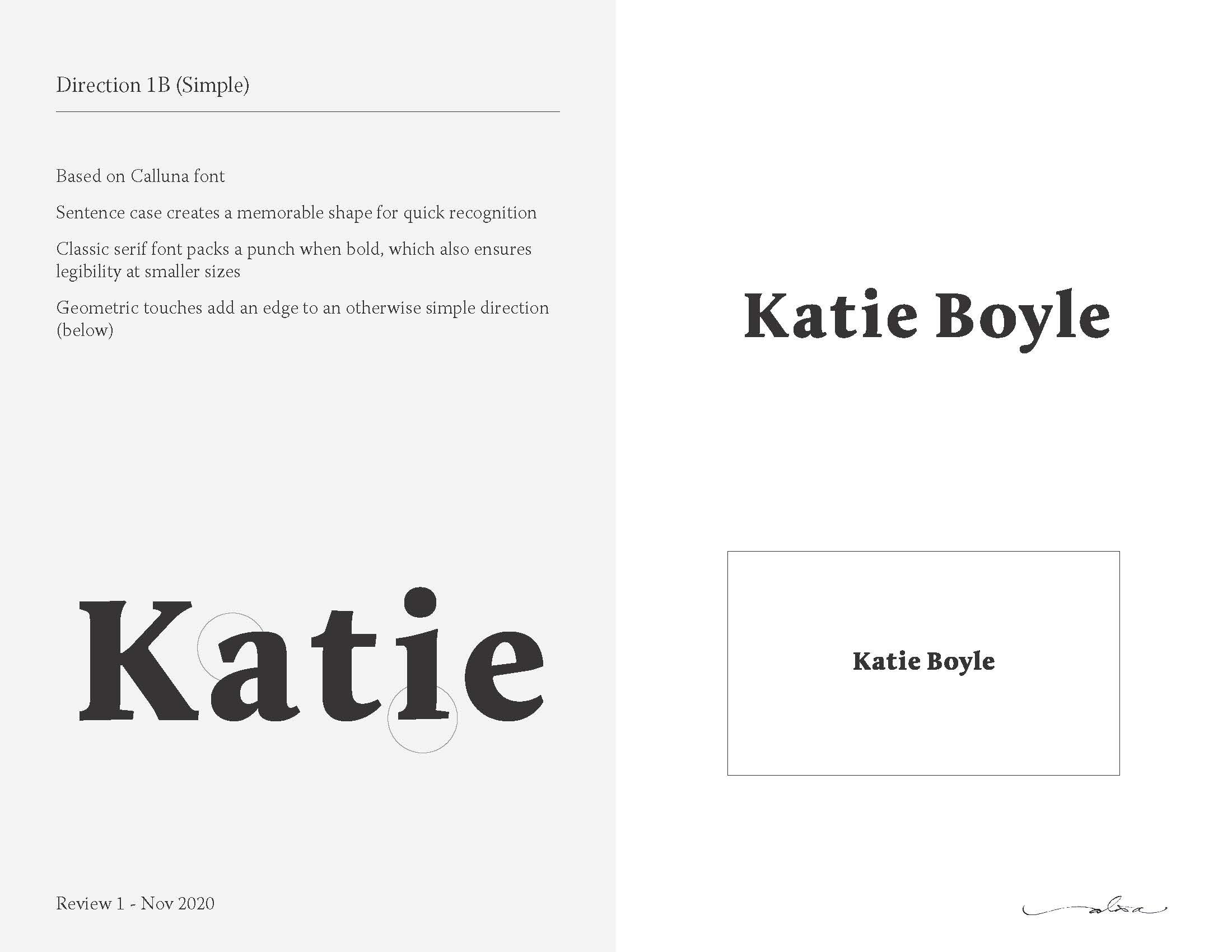
Katie sought something simple and timeless that could be used on stationery and influence her website design. Notably, she was ready to start using her full name as a wordmark while reserving her initials for a secondary mark to echo the original logo.
Inspiration came from a spirit of confidence and boldness as well as a recently discovered hand dremel that was used to brand fine jewelry with a family member’s initials.
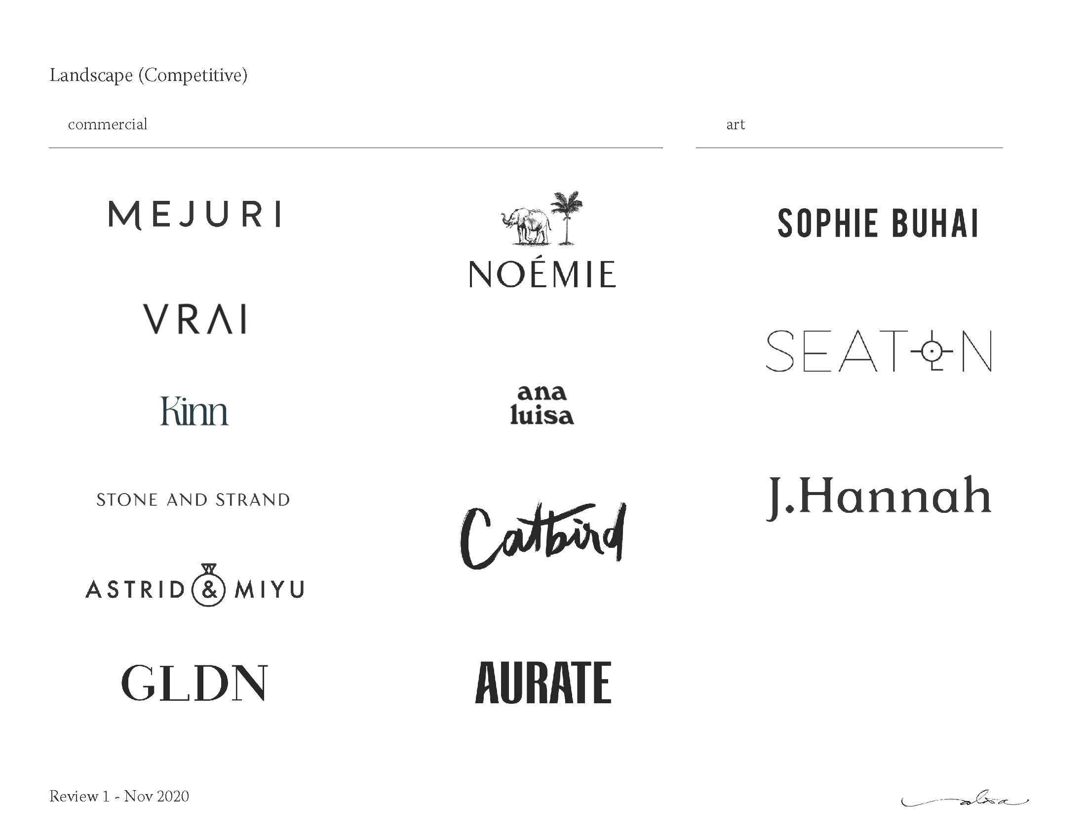
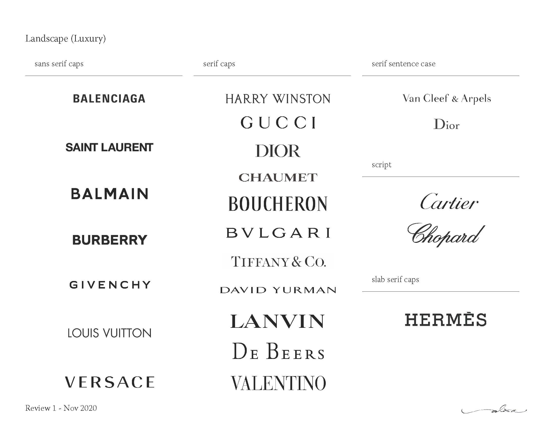
Landscape exploration revealed a field saturated with all-caps logos in sans serif or serif typefaces, and so the challenge became to develop a wordmark that would stand out while fitting in.

The design
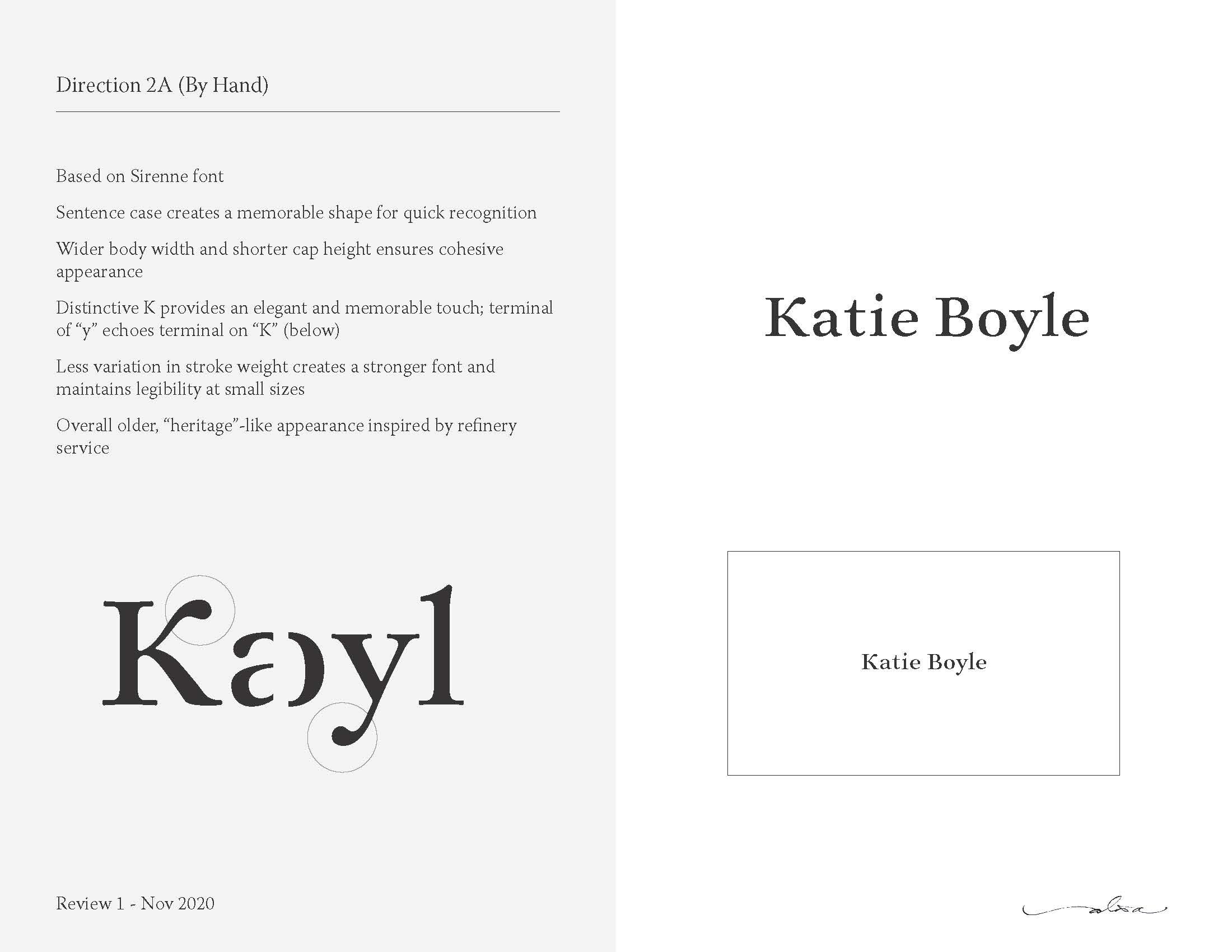
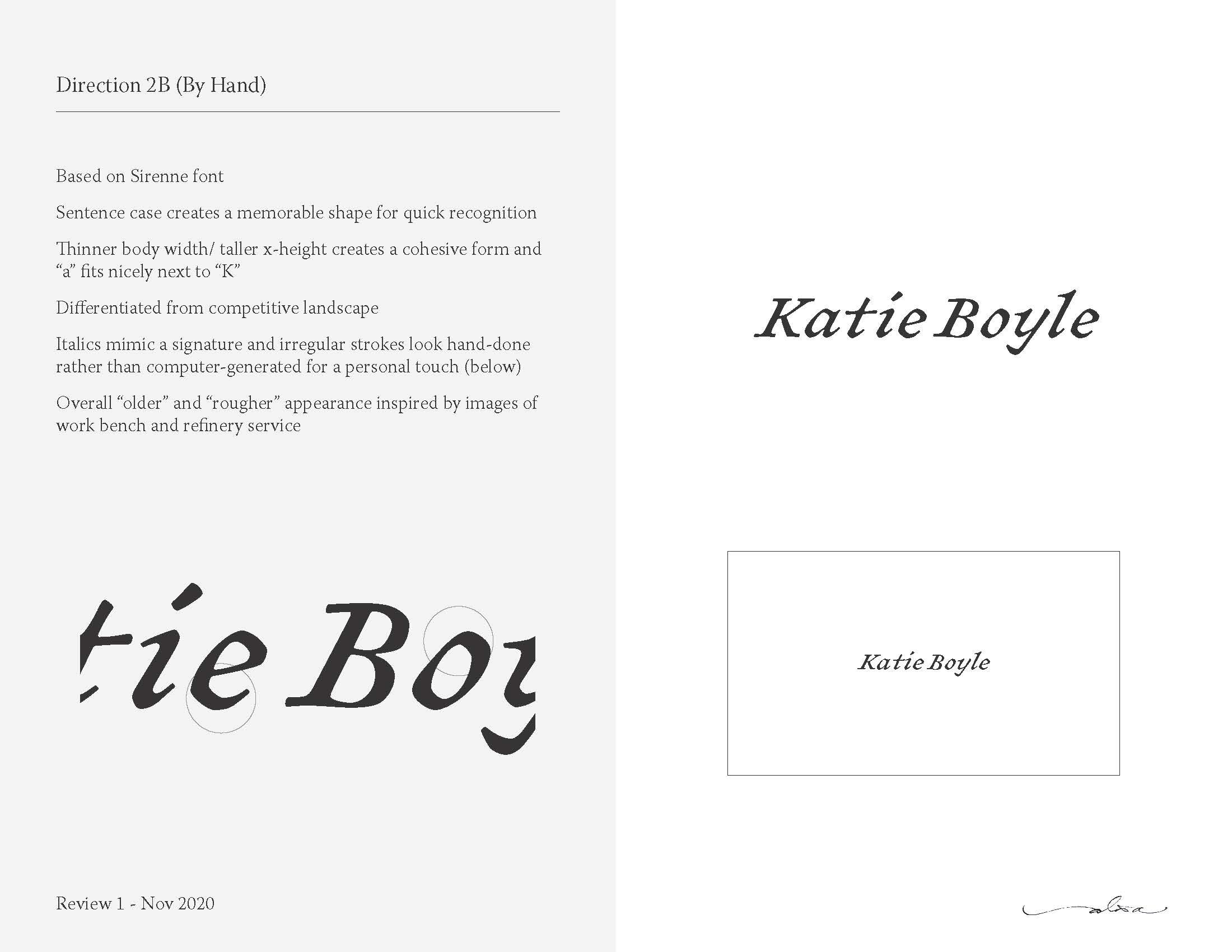
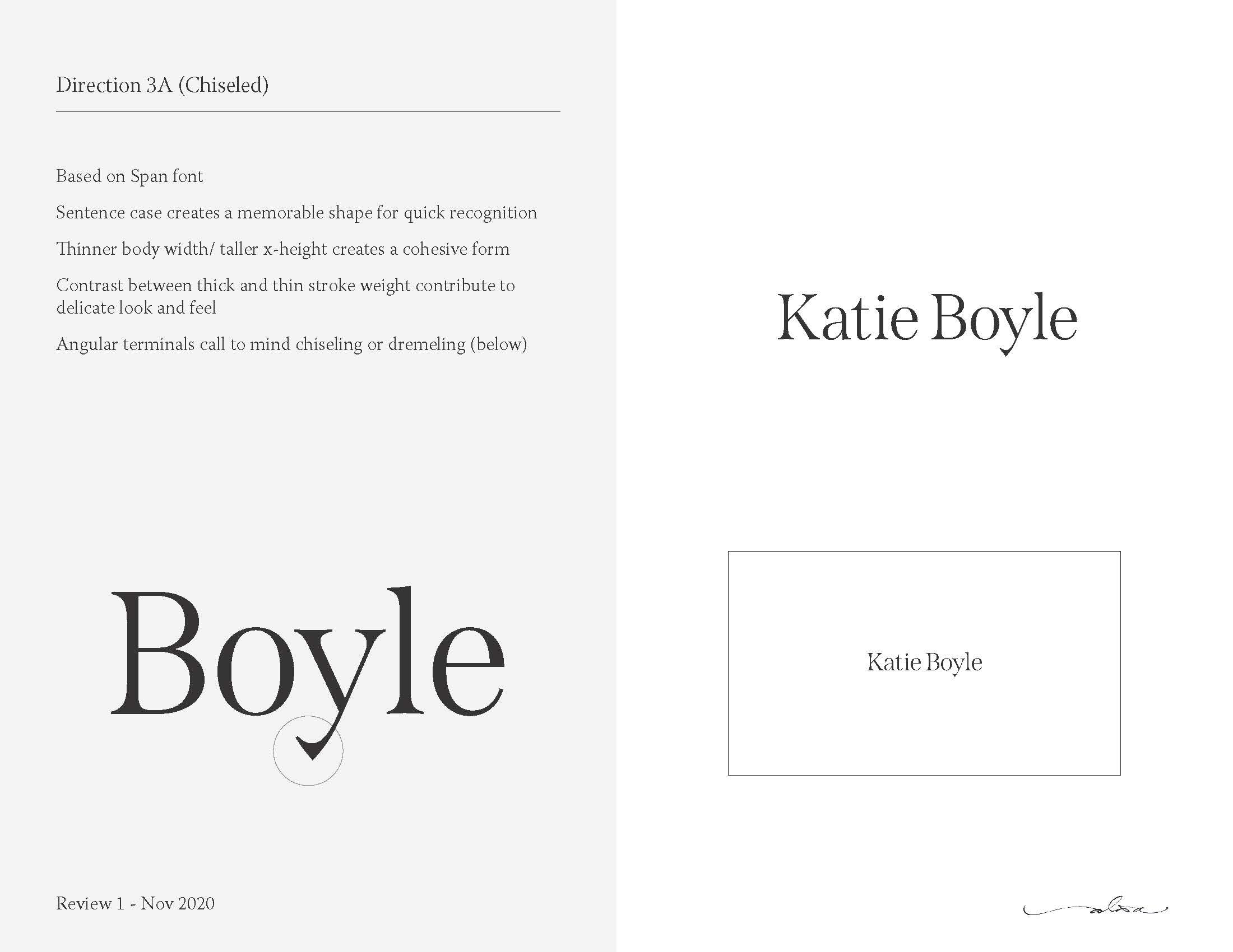
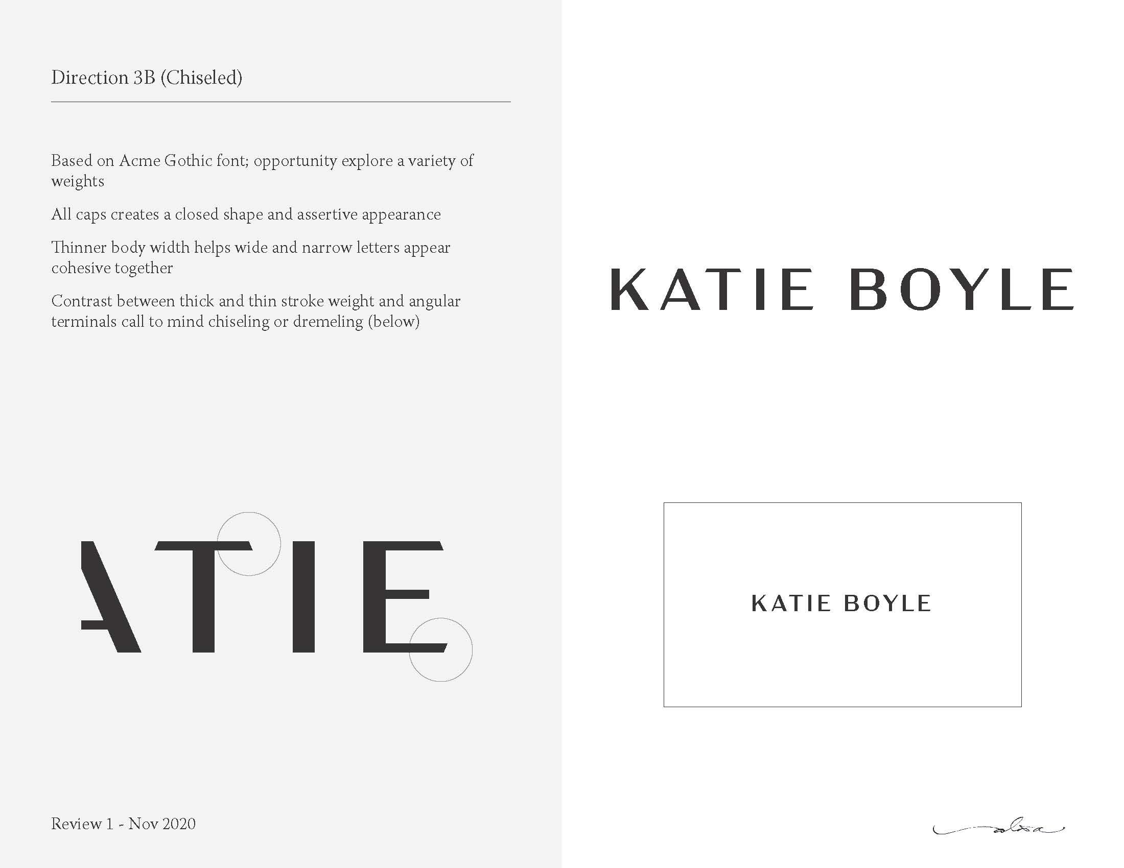
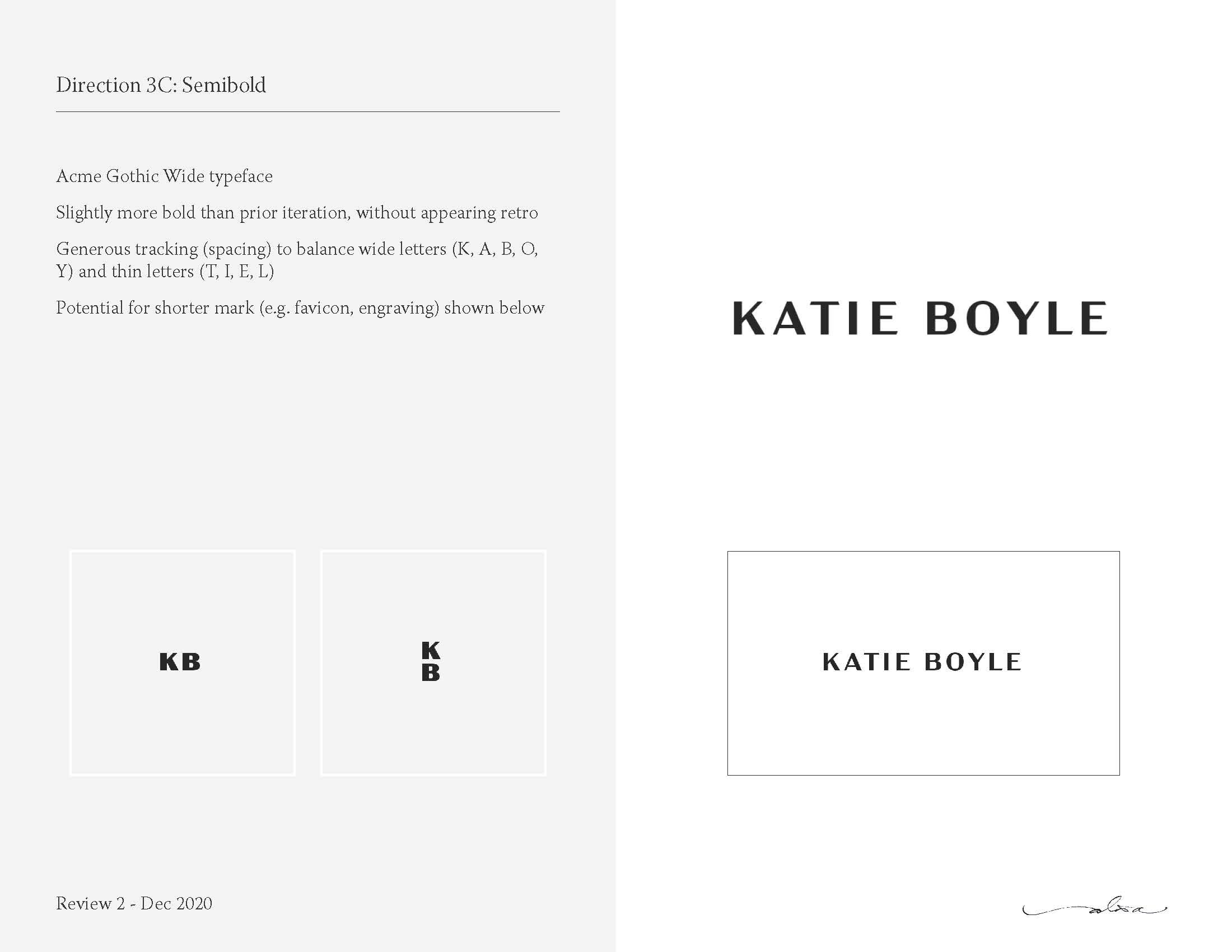
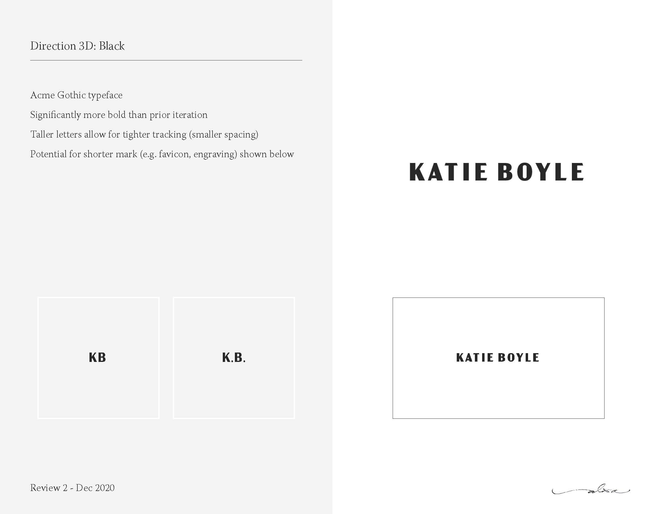
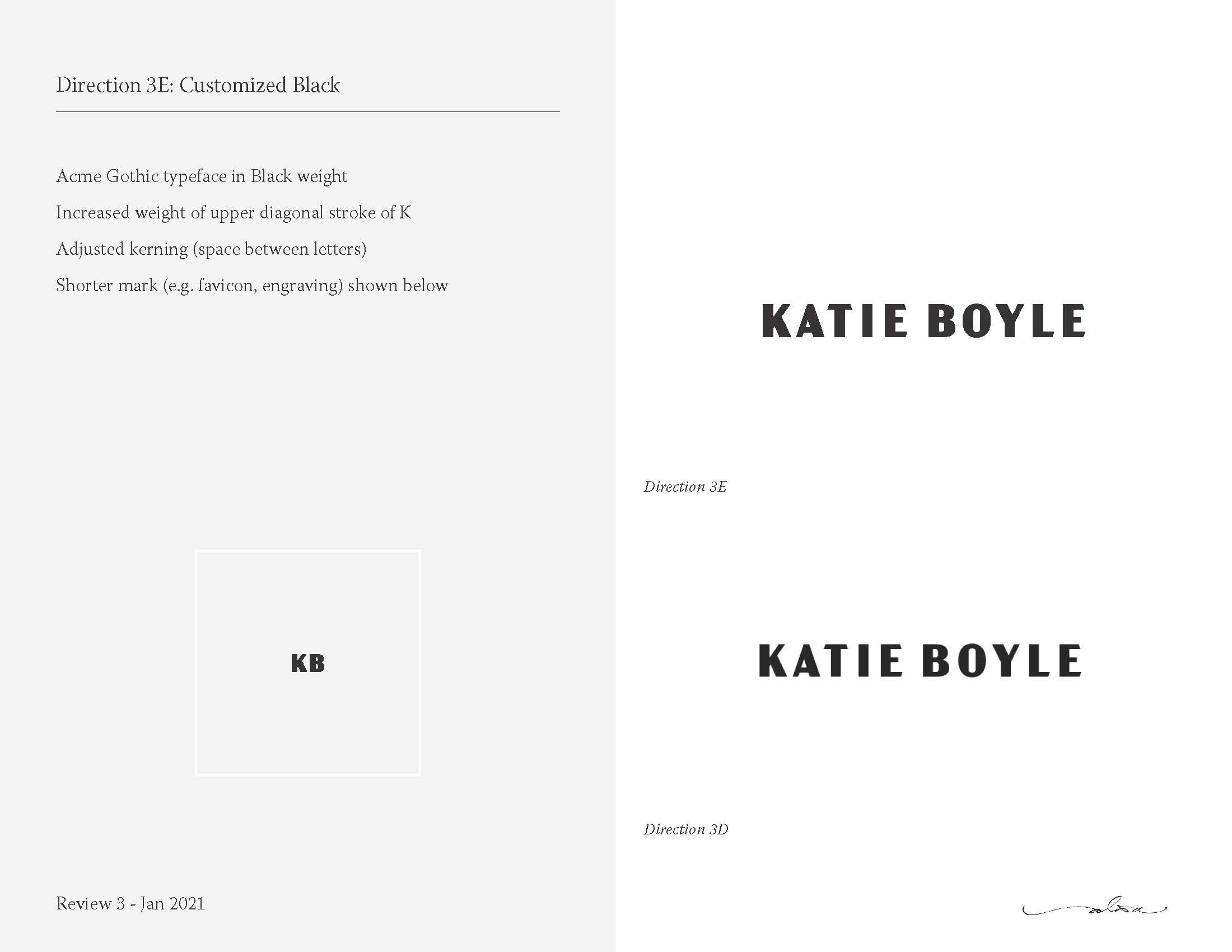
Exploration included “simple,” “by hand,” and “chiseled” themes that drew upon the physicality of jewelry design and production. The chiseled design proved to be the most promising, and refinement focused on the Acme Gothic typeface in heavier weights.
In the final design, the contrast between thick and thin stroke weights in combination with angular terminals are intended to call to mind chiseling or the dremel. The thinner body width of the font helped wide (K, A, B, O) and narrow (T, I, E, Y, L) letters appear cohesive together and allowed for tighter tracking. All caps were used in a black weight to establish an assertive appearance and follow the gestalt Law of Closure. Finally, the upper diagonal stroke of the K was adjusted to increase its presence as the leading initial.
A favicon of the KB initials was also created.

The website
Although website design was handled by a third party, font recommendations were provided along with preliminary mockups. The following fonts were selected to complement each other and offer contrast in order to create hierarchy while reinforcing the brand:
Headers
Headers can reinforce a brand language by echoing the look and feel of the logo without using the same typeface as the logo (to keep the wordmark primary). Consider fonts with characters that are generally the same proportion as the wordmark, and that offer a variety of weights.
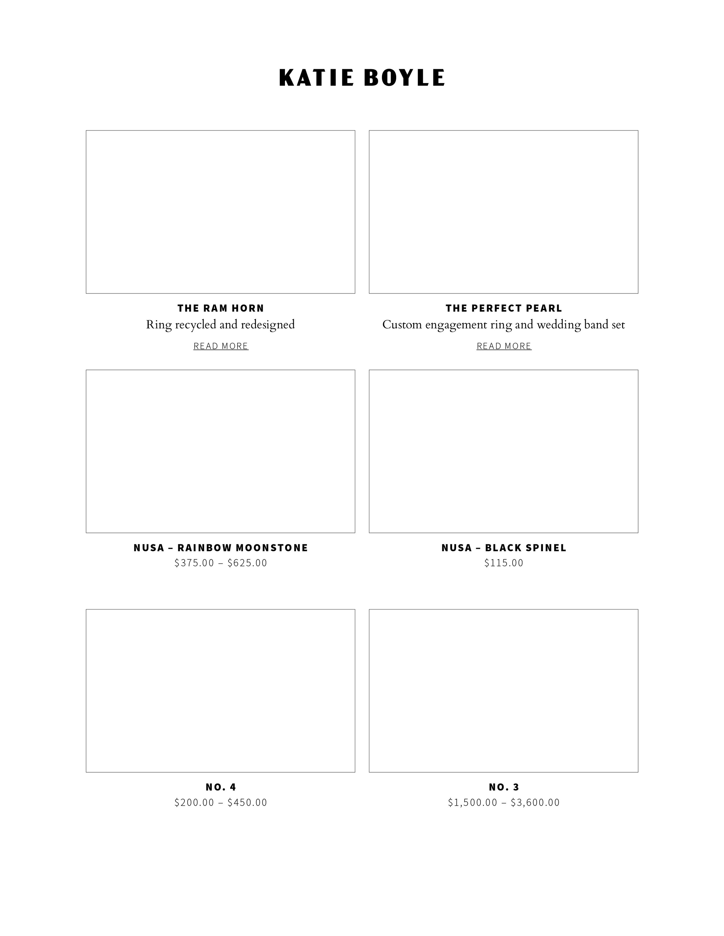
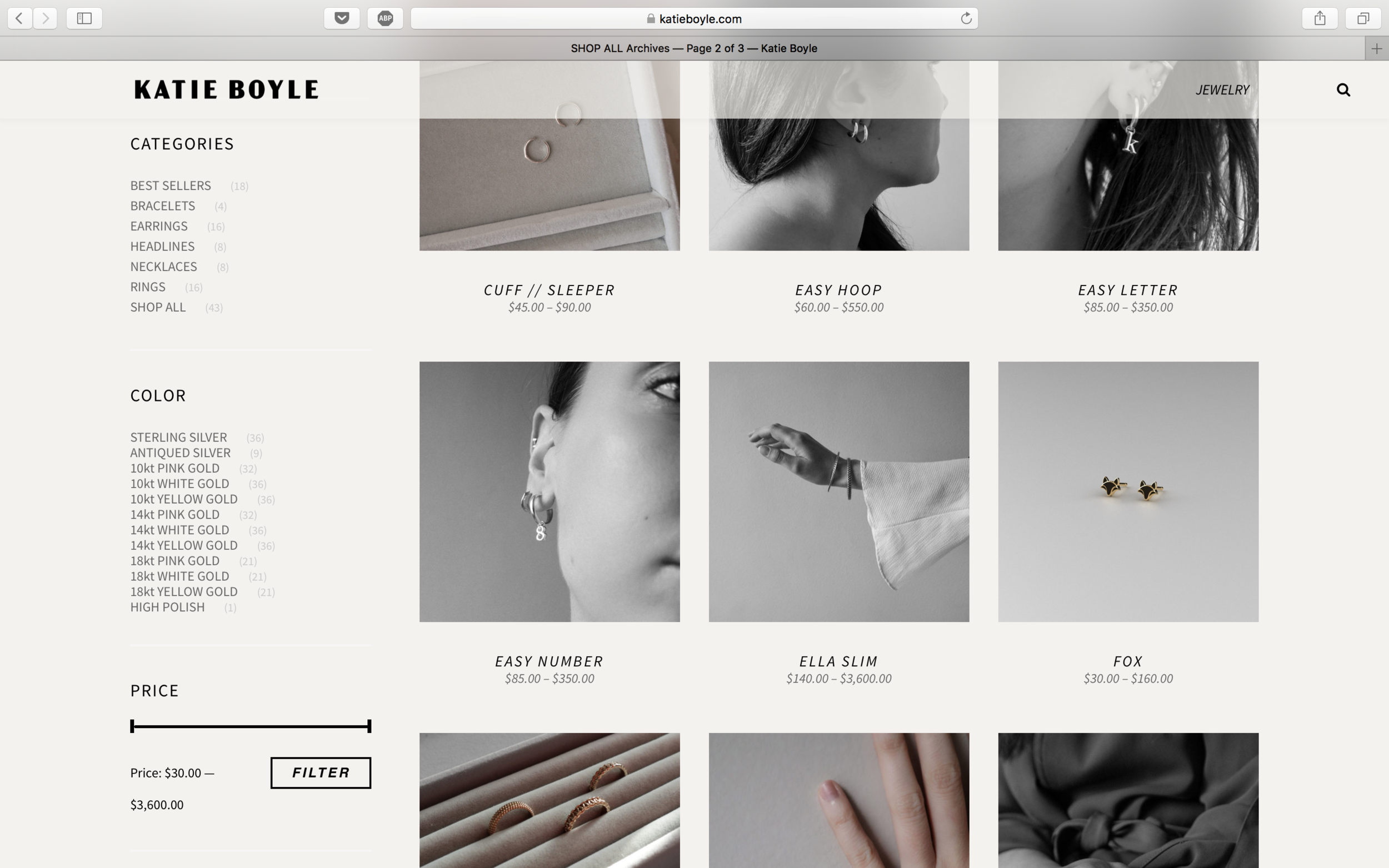
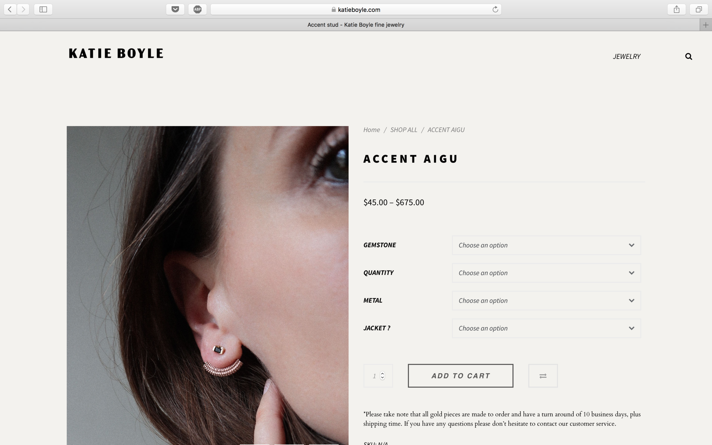
Recommendation: Source Sans. Source Sans was the first open-source font family from Adobe and is available in a wide variety of weights. It is shown here in Black for headers (e.g. product names) and Regular for sub-headers (e.g. links, prices).
Body
Body copy presents a good opportunity to use a serif font as a link to the original “kb” logo, and to contrast with a sans-serif selection. Consider Old Style (or Humanist) fonts, which are based on the hand lettering of scribes - appropriate for the bespoke category.
Recommendation: Cardo. Cardo is a Google font supported by Adobe and is available in regular, italic, and bold styles.
Feedback
“I have had the pleasure of contracting Alisa for multiple projects since 2017, and her creative brilliance never ceases to impress. Our first collaboration involved her exceptional illustration skills, where we worked together on a holiday season campaign. In 2020-21, I called upon Alisa again, this time to utilize a different skill within her impressive toolbelt: branding. I commissioned her to create a rebrand for my business, specifically a new wordmark. The experience exceeded all expectations, and to this day, I still smile when I think about how thrilled I am with the outcome.
Alisa has the rare ability to capture the essence of where you are in the moment while also reflecting the direction you're heading. One of the most memorable moments of my entrepreneurial journey was signing off on the final edit—feeling the excitement of a true win, knowing it aligned perfectly with the designer I’ve become. I will always be grateful for that experience.
A year later, I turned to Alisa again, this time for her design expertise in executing the stationery concept I had developed for my brand. Once again, she hit it out of the park.
Alisa is professional, articulate, trustworthy, and incredibly talented. I would recommend her in a heartbeat.”